Overview
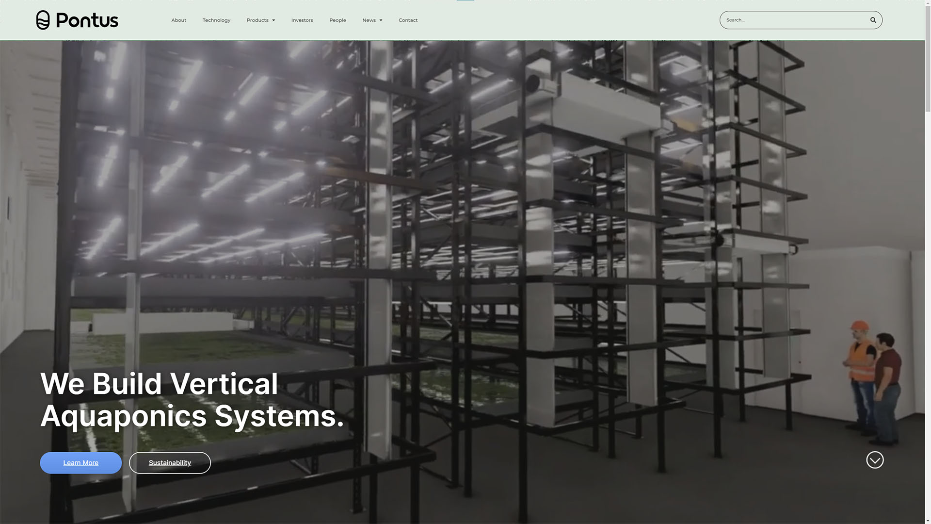
Pontus Protein is an agricultural technology company based in Vancouver, BC that is reinventing agriculture with their proprietary aquaponics system that will take farming into the future. They specialize in stackable aquaponics that uses 95% less water than traditional agriculture and no pesticides or chemicals. Pontus has set out to solve the global food crisis with their innovative technology. What sets them apart from others is that their water lentils can be harvested every 24 hours, organic, and can be grown in any climate in a small area.
Project Details
Type
Client Project
Role
Web Designer, UX UI Designer
Tools & Skills
Figma, Wireframing, HTML, CSS, WordPress
Process
Pontus already had a website, however it needed a design refresh, backend cleanup, and styling updates to match their current branding guidelines. Starting from the ground up we started planning and wireframing out potential design directions. After consulting with both Pontus’ and our creative director we established a direction and created high fidelity wireframes. Once we achieved approval, we translated our designs from static pieces to a full interactable piece on WordPress.
With WordPress, we chose to set the base foundation up with Elementor as this would allow our clients and other designers or developers to make further changes down the road easily. To help make Pontus’ site stand out from other competitors, we added in additional HTML and CSS to achieve a full custom aesthetic and manipulate existing widgets to match our wireframes.
Challenges
A design challenge that we faced during this project was for the layout to be fully responsive for all types of screens. In most cases, designing for the standard three breakpoints, desktop, tablet, and mobile screens would suffice. However, we found that due to the design direction and content restraints we had to adapt the layout to work effectively functionally and aesthetically. To address this responsive problem, we had with our proposed design, we added in two additional breakpoints, ultrawide displays and smaller laptop screens. Now having five points of adjustment, our design was able to account for excess whitespace on larger than normal displays and seamless placements of content, such as a fixed aspect ratio video without compromising the general layout and design.
Final Thoughts
From this project, it has challenged me to preplan during the initial design process with my knowledge of what was available design and features wise through WordPress and Elementor. In addition, even though a plan and design has been set from the initial phases is not always concrete as software limitations and challenges may always arise even with adequate planning. Yet, thinking on the spot and adapting and adjusting accordingly is the best way to overcome such problems.