Overview
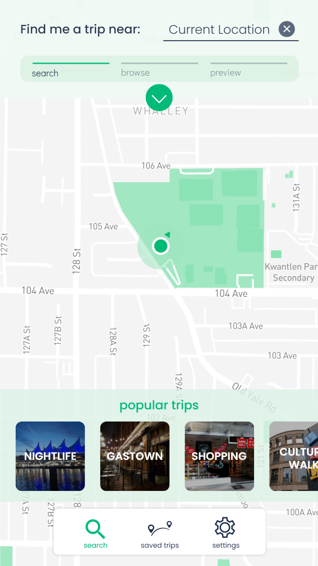
Away is a day trip planning application, centered on planning around one main location. The goal is to help users quickly find and filter nearby locations and staying safe during COVID-19.
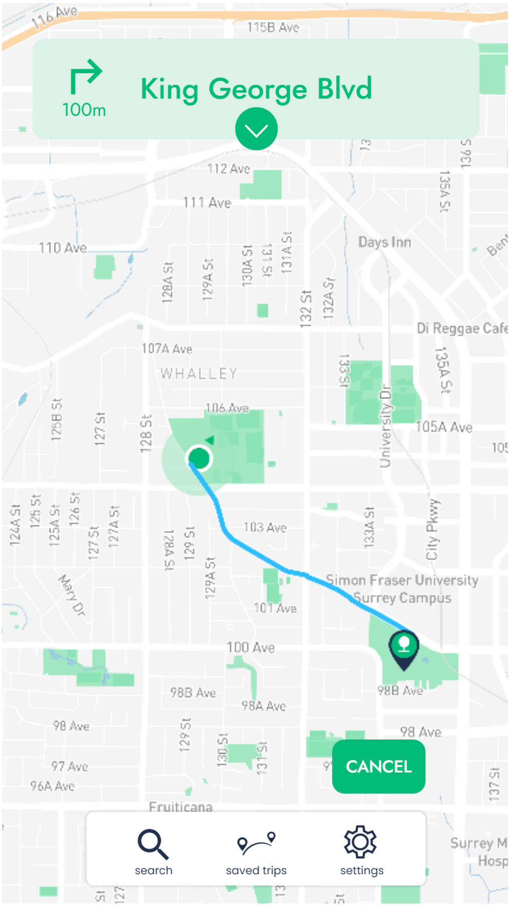
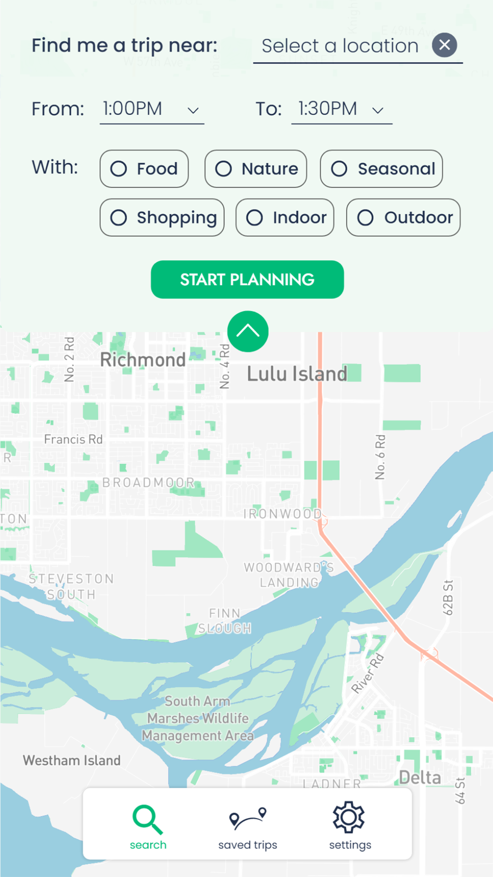
Geared towards various types of users, yet all achieving the same intent of allowing users to spend less time searching for recommendations and spend more time enjoying their trip. One mean of using this application can be achieved through GPS, as it can obtain the user’s current location and suggest additional locations that suit their interests and time needs. Planning ahead of time is also simple with A-way as travellers would enter a starting point, browse, and add their activities, and hit save.
In comparison to other trip planning application, this minimalist interface is intuitive to use, and never intends to overload the user with buttons, options, or information. A-way curates ten nearby recommendations based on the user’s search input, or GPS location, hence reducing the overwhelming options. In addition, finding reviews, store hours, and images are all gathered in one place, they are available just by tapping the “Details” button.
Project Details
Type
Course Final Project
Role
User Tester, Prototyper/Coder
Tools & Skills
Prototyping (Framer & Figma), User Testing, Wireframing
Features
.png)
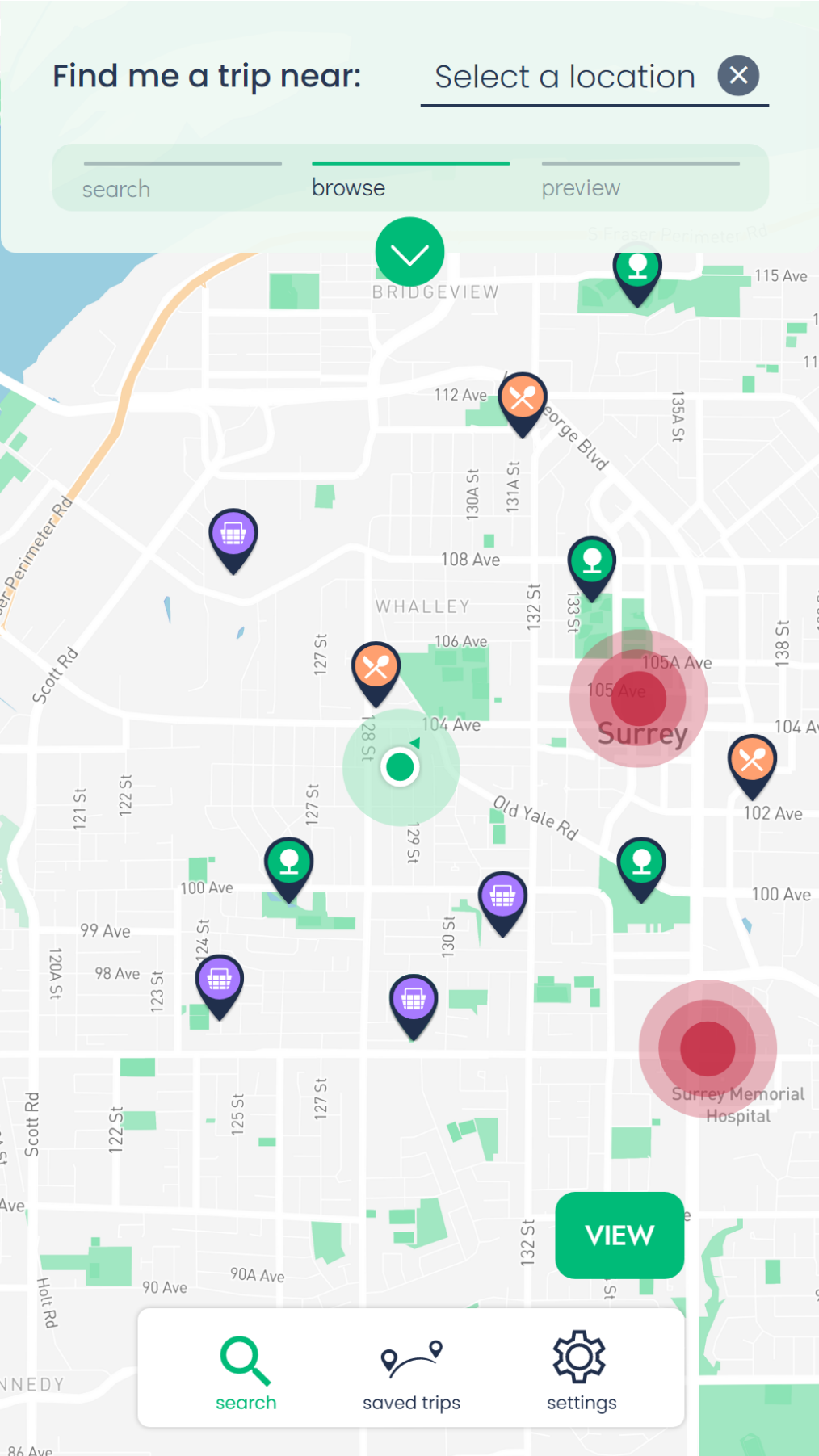
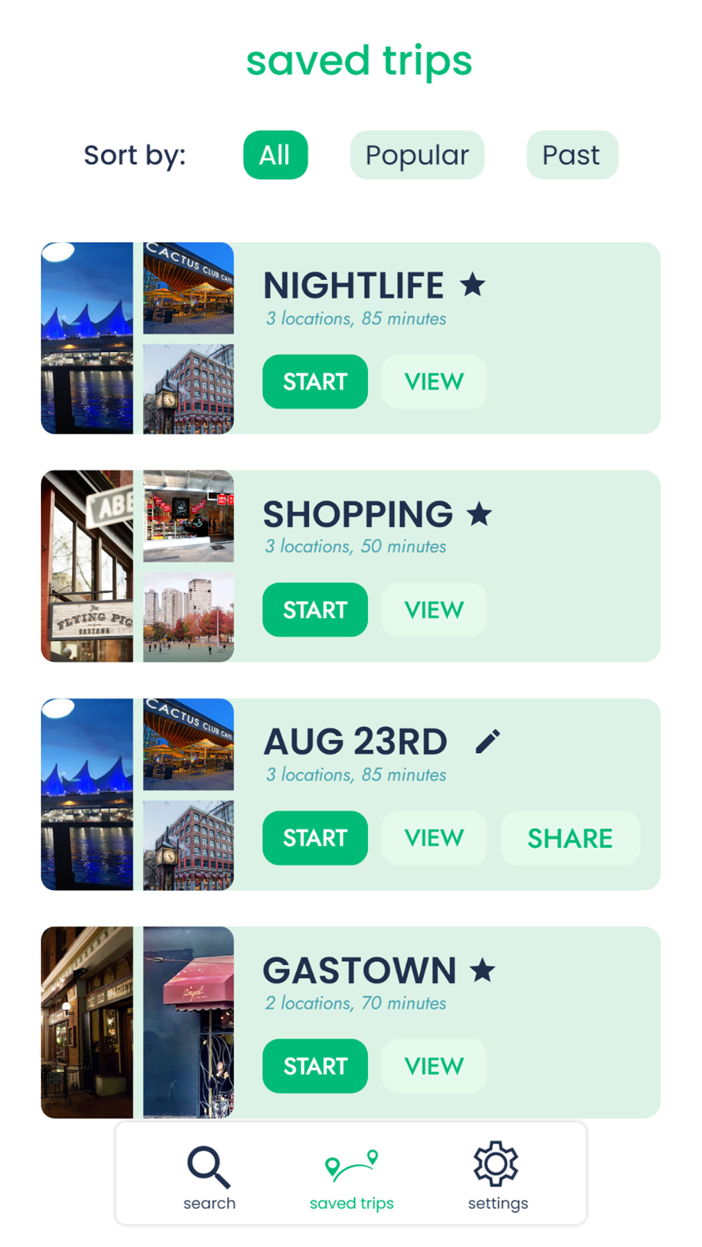
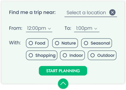
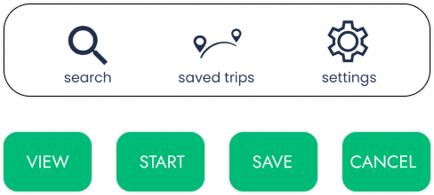
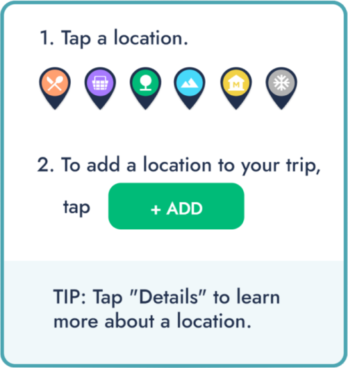
The main features of A-way are the searching and filtering elements, as they help narrow down the search results for the user. Such filters include category, location, and time duration. As well, A-way provides users an easy way to view detailed information for each suggested location just with a click of a button..
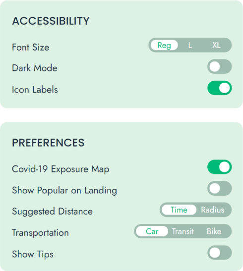
Additional features include a toggle for dark and light mode, a switch to display COVID-19 exposed areas, and a customizable interface by toggling the popular trips on the landing page.
Design Decisions
For our key interactions, we focused on creating an efficient and intuitive interface by making our affordances more apparent for our users who are on-the-go.
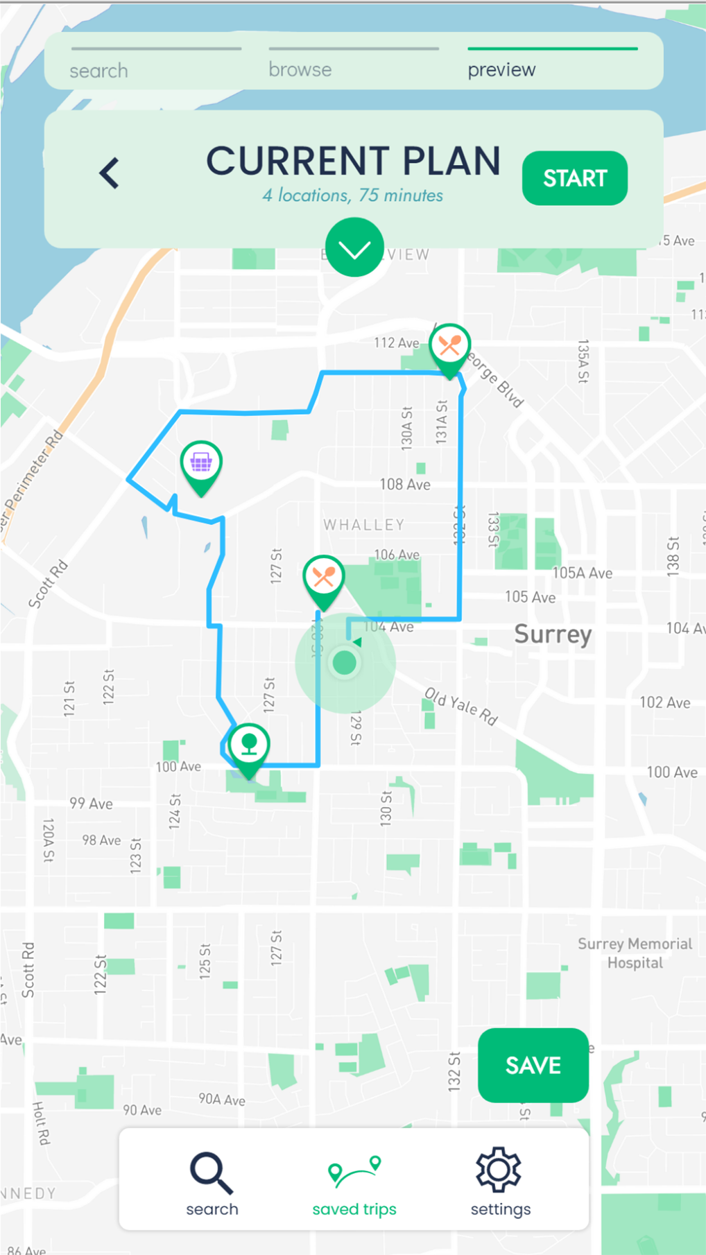
Our user testing revealed that users needed feedback on their progress, as per the visibility of system status heuristic. So, we added a progress bar above the map to show their progress in creating a trip.
We distinguished the styling for our buttons, input fields, and filtering options so users would not confuse the different interactions. As well, we increased the size of the interactive elements as per Fitt’s Law to enhance the speed and accuracy of tapping elements. We paired labels with icons so users can know what to expect from each interaction.
Key Paths
When redesigning our key interaction path, we focused on keeping the interface clear by reducing the interaction options to the necessities and by implementing accurate feedback for the user’s actions. We made our different interaction options more distinct and maintained consistent page structures and formatting. From the user study, our users struggled with creating a trip, so we incorporated an onboarding process that appears when users launch the application for the first time.
Affordances
By reducing the interaction options and visual clutter of the interface, it made the affordances clearer and improved the user’s experience, which was evident in our final user test in comparison to our initial user test.
Visual Language
The visual language was strengthened and helped clarify the interface’s options, type, and colours, hence allowing us to focus on the visual language and impression we wanted the application to give.
Microinteractions
Microinteractions such as feedback modules and personalization features, allow users to enhance their experience and grow a deeper connection with the application.
Final Thoughts
Throughout this application, we started with a good foundational concept of a day trip planner. However, through user research, user testing, and obtaining feedback from the teaching staff, we were able to grow and develop the concept to our final stage. With the user interface, that was also evolved from the preliminary stages, which is evident from our wireframes, visual language, and user flows. Prototyping with Framer was my team’s first time and coding was not our strong suit, but through learning on the spot we were able to achieve a final prototype that represents the learning and skills we’re grown in this course.